How to Choose the Right Color Palette for Your Home
Choosing the right color palette for your home is one of the most important steps in interior design. It’s about more than just what looks good—color has the power to affect how you feel in a space. The right hues can bring calm to a busy room, warmth to a cold one, or energy to a place that feels dull. At EasyCount e, we believe thoughtful color design transforms not only your home’s aesthetic, but also your everyday experience within it.
Whether you’re revamping a single room or redesigning an entire house, understanding how colors work—and how they work together—will help you make confident choices that reflect your personal style and enhance your living environment.
Start With Emotion: What Do You Want to Feel?
Before picking up a paintbrush or browsing swatches, pause and ask yourself: What do I want to feel in this room? The emotional tone you want to create is the foundation for choosing your palette.
- For calm and relaxation (ideal for bedrooms or reading nooks), consider soft blues, gentle greens, muted greys, and earthy neutrals.
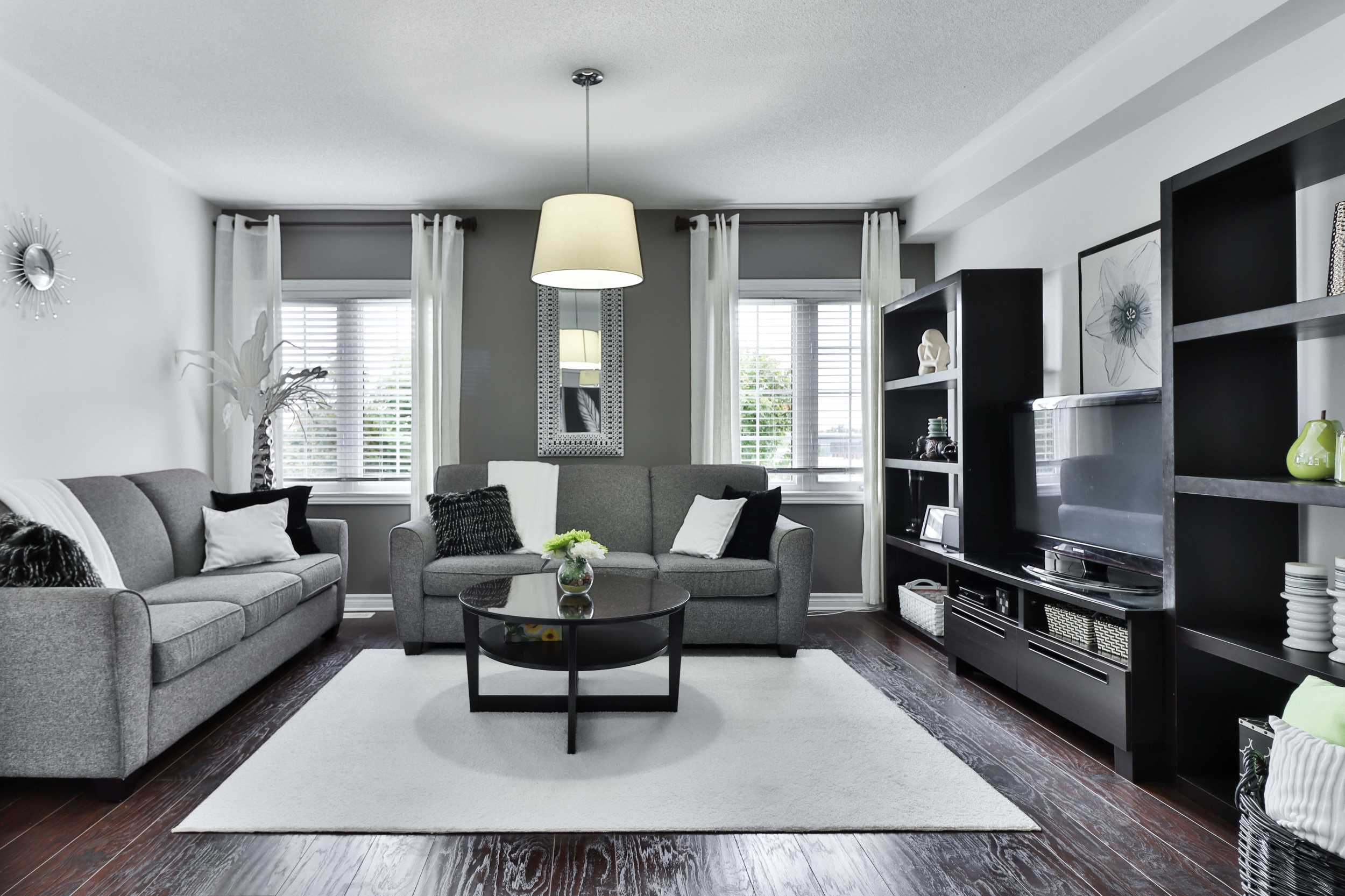
- For warmth and coziness, like in a living room or den, go for rich tones like terracotta, caramel, mustard, and warm beige.
- For energy and creativity, perfect for kitchens, studios, or home offices, try bold shades like deep teal, coral, or sunny yellow.
Color psychology is subtle but powerful—don’t underestimate how much a room’s palette influences your daily mood and mindset.
Find Inspiration in the Everyday
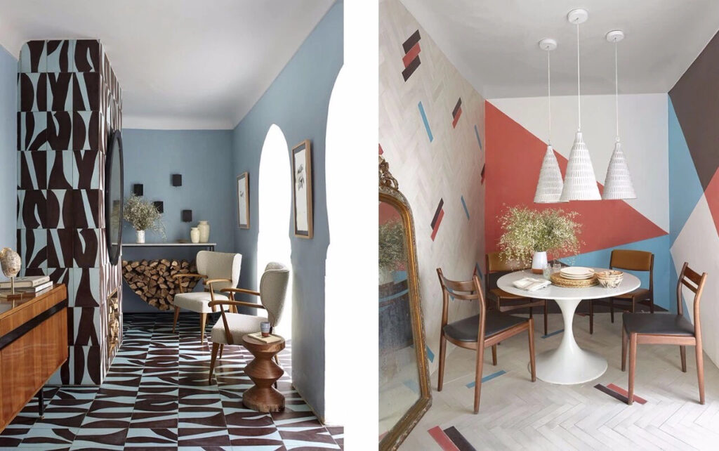
Color inspiration can come from anywhere: nature, fashion, art, travel, even your favorite coffee mug. Look around your life for tones that spark joy or calm. If you’re drawn to coastal landscapes, maybe soft sandy beige, pale seafoam, and deep ocean blue form your perfect palette. If you love Scandinavian minimalism, crisp whites, light wood tones, and smoky greys might be more your style.
Moodboards and Pinterest boards can be helpful tools. Gather images that speak to you—not just rooms, but textures, fabrics, and color combinations from unexpected places. Patterns will begin to emerge, and you’ll start to see what colors naturally attract you.
Use the 60-30-10 Rule for Balance
Once you’ve selected a palette, a helpful trick for applying it in a space is the 60-30-10 rule:
- 60% is your main color (usually walls and large furniture pieces),
- 30% is your secondary color (used in upholstery, rugs, or curtains),
- 10% is your accent color (used in artwork, cushions, vases, or decorative details).
This simple guideline ensures balance and visual interest without overwhelming the room.
Don’t Be Afraid to Use Neutrals
Neutrals are far from boring—they’re the unsung heroes of interior design. Shades like warm taupe, creamy ivory, cool slate, and soft greige offer a timeless base that pairs well with bolder accent colors. They can bring elegance, depth, and softness to a room while allowing you to play freely with textures and accessories.
If you’re hesitant about color, starting with a neutral base and layering in color through textiles and artwork is a safe and stylish approach.
Create Flow From Room to Room
While each room can have its own personality, your home should feel like a unified space. Carrying certain colors throughout different areas—even in small amounts—creates a visual connection that feels intentional. You don’t need to use the exact same palette everywhere, but colors that share undertones (like warm or cool bases) will make transitions feel natural.
For example, a soft sage green in the kitchen might transition beautifully into a dusty blue in the living room, especially if both share grey undertones.
Test, Test, and Test Again
Lighting dramatically changes how a color looks in a space. A shade that seems perfect in the store might appear too dark in your north-facing bedroom or too bright in afternoon sunlight. Always test your colors on your actual wall, at different times of the day, before fully committing.
Use paint samples or peel-and-stick swatches to get a true sense of how your chosen colors behave in real life. This step is crucial and will save you from expensive mistakes.
In Summary
Choosing a color palette for your home is both a creative process and a deeply personal journey. The best palettes aren’t just trendy—they feel right. They reflect who you are, how you want to feel, and how you live.
At EasyCount e, we encourage you to slow down and be intentional. Start with emotion, build from inspiration, test with care, and above all—trust your instincts. Your home should be a place where style meets comfort, and where every color tells a part of your story.
Hi, this is a comment.
To get started with moderating, editing, and deleting comments, please visit the Comments screen in the dashboard.
Commenter avatars come from Gravatar.